There are some basic factors that drive marketing communication today – what designers call ‘vanilla facts’: one, the internet is where everyone goes for information today; two, infographics are a great presentation technique, as they organize material in interesting, eye-catching formats.
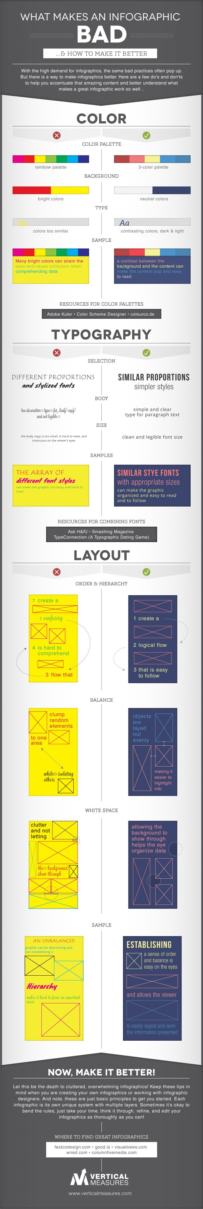
However, it is equally easy to create a confusing, untethered infographic where information has been placed without any strategic considerations, or without understanding of how the human eye reacts to computer images. This infographic shows, step-by-step, how to create a visually appealing infographic that delivers content effectively.
What Makes an Infographic Design Bad & How To Improve It:
Infographic by – Vertical Measures