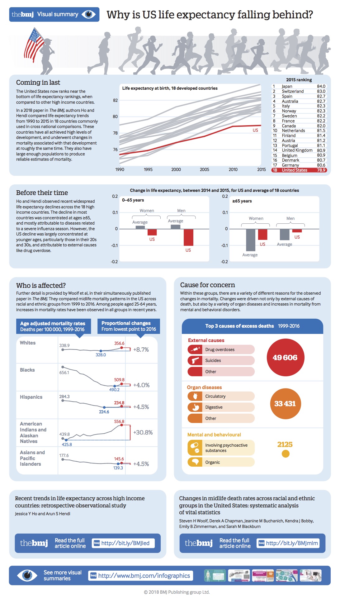
In a 2018 paper published in the BMJ (British Medical Journal), nation-wise life expectancy trends from 1990-2015 were compared, with the focus on 18 high income countries who have, consistently, shown high levels of development. Surprisingly, while all other 17 nations showed a continual upward graph for life expectancy, the graph for USA flattened from 2010 onwards, and its ranking was the lowest!
What’s more, unlike the pattern in other nations, in USA the changing decline pattern was concentrated in the 20s-30s age group! Read this infographic to understand the probable causes for this dramatic shift.
Why Is US Life Expectancy Falling Behind?
Infographic by – BMJ